Last year there was the big issues with GAP changing their logo. I remember seeing their new logo and not even realizing what it was for, I was so used to the old logo and automatically putting that with the clothing line. I think it was good for them to go back to the old logo, but they spent alot of money on changing their logo to no avail with nothing but complaints. I have also noticed the Captain Crunch box has changed a little bit, the cartoon character is a completely different looking captain. When I first saw this I just thought it was a cheaper generic version of the cereal. It is just weird to see companies try to revamp their look and change their look or logo, it works for some but can backfire for some others.
I also found an interesting article a while back about a company pulling an advertisement because of a lawsuit for false advertisement. This advertisement company was making a ad for a law firm looking to help families of firefighters who died or got injured from the 9/11 attacks. The picture they used was of a dirty firefighter holding a picture of the ground zero devastation. But, the firefighter was actually holding his helmet when the picture was taken and they super imposed the picture in his hands. This upset the firefighter because he was not a firefighter until 2006 and felt that his picture being used that way was wrong and filed suit. I tip my hat to this man for doing so and not letting his picture to be used in a way he was unaware of. Here is the website with more information http://www.nypost.com/p/news/local/agency_pulls_controversial_ad_ttIJMdgnLsZ4lQK5Es8foM
Sunday, May 15, 2011
Final Project
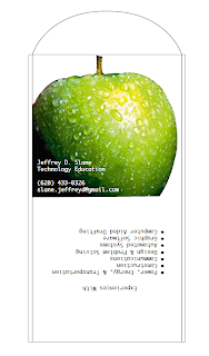
For the final project I decided to make a self-promotional piece that I could take to interviews and leave with possible employers. I designed a envelope with a width of about an 1/8 inch. The envelope will be able to hold a CD with a digital portfolio and some small picture leaflets that describe some projects. I felt good with how the final piece turned out.
I used a reverse type on top of the apple on the front of the envelope to show my name and contact information.
Publication Ad print
I chose to do an alcohol ad because they are fairly popular in the magazine. I did Captain Morgan, it is a popular drink advertised everywhere. This is a picture I took back home with simple point and shoot digital camera with some decorations my mom had. Of course the theme here would be for a December issue closer to the Christmas holiday. I chose the font because I thought it looked similar to text on the bottle. I also created a half-page horizontal with a logo that I got a free download of from brands of the world.
Publication Ad continued
For my publication I chose Men'sHealth as my magazine publication. I found it amazing at the cost of a full page ad was $186,455, but that is running in an estimated 1,800,000 copies of the magazine. I chose Men'sHealth because it is a magazine I receive and enjoy looking at. The size of the design with a bleed is 8.5 inches by 11.125 inches. It has a nice size gap on the sides for the liver area and trim down area so the information will still be readable after binding and cutting.
Newspaper Ad print
I chose to make an ad that would advertise a Middle School Dance I would host. I used a bitmap for the speakers I hand drew and scanned in. The border is a vector image I created in Illustrator.
Call to Action - Getting middle school students interested in coming to the dance
I advertised to not only catch the eye of middle school kids, but also there parents since they would be dropping their children off and picking them up.
Newspaper Ad continued
For my newspaper ad I decided to go with the size of 4 column inches by 7 inches. So it came out to 7.71 inches wide by 7 inches tall. The over all cost for this ad would be around $72 for one run.
Variable Data Prints
For the pictures I used, they are some I took myself and some pictures I borrowed from the bed and breakfast. This top image is of the postcard for male recipients.
This second image is for the postcard of the female recipients.
These last two images are of the backs of the postcards. For the female recipients I advertise more of the option the Circle S Ranch has for wedding receptions. And for the male recipients I just chose to advertise a weekend getaway. For the text I chose I wanted to go with the felt marker font to give them a hand written feel.
Variable Data continued
For my variable data, I chose to make an advertisement for a bed and breakfast I have visited outside of Lawrence. I chose to have a full-bleed picture for a background, then I have a strip of smaller pictures on top of that.
On the back I have an informational paragraph with contact information for them to use to gather more information on the bed and breakfast.
Tuesday, March 1, 2011
Final design for self promotion notepad
The final design I chose for my notepad has a basic header with a boarder listing all the classes I have learned to teach throughout my courses. This project was made to promote my skills to possible employer with a notepad. Also I left my e-mail address in the bottom right corner so they can contact me and included a QR code that will take them to my blog page so they can see other projects I have created.
I created all images for this project using Illustrator and Photoshop, all the text was created in InDesign.
Price Quote for the self promotion notepad
I got a price quote for the self promotion notepad at quick print on the main campus. For the quote I asked for a 50 sheet notepad, black ink only with a bleed, 5x7, with padding and a chip board backing.
The price quoted for me was $3.13 a piece.
Tuesday, February 22, 2011
Photoshop Formats
4 color raster edited in Photoshop
Grayscale raster edited in Photoshop
Duotone raster edited in Photoshop
COB clipping path edited in photoshop
Subscribe to:
Posts (Atom)


